One year ago I’ve released BWWalkthrough, a library that simplifies the creation of walkthroughs without any constraints on user interfaces design.
The library became quite popular on GitHub, so I’ve decided to write this tutorial to help you guys set up and use it with ease.
Here is a sneak peek of the final result of this tutorial (or check it directly on Vimeo):
Installing the library
If you use CocoaPods include this line into your Podfile and launch pod install command.
pod "BWWalkthrough"
To manually install the library just drag and drop these two files inside your project BWWalkthroughPageViewController.swift and BWWalkthroughViewController.swift, they are stored under “Pod/Classes” folder.
How it works
To create this library I’ve identified the main elements that are needed for a walkthrough:
• Previous/Next page buttons to move through the walkthrough pages (obviously, a user can also drag the current page left and right to navigate through the steps).
• A Skip/Close button to immediately close the walkthrough.
• A Page Control to identify the current page and all the walkthrough steps.
• A list of Pages/Steps to show.
BWWalkthrough essentially provides you with all the logic needed to easily build a walkthrough with all these items, your only task is to define the walkthrough UI (and, if you need it, customize the animations).
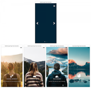
The walkthrough logic is organized in 2 main areas: a Container and the Walkthrough pages.
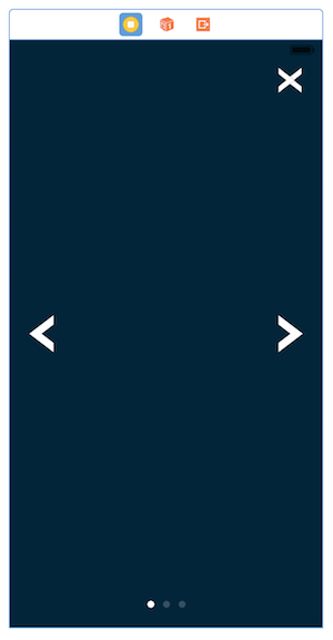
The container is where you put the buttons and the page control, the pages are the single steps of the walkthrough. So the container is always shown and it is responsible to presents the walkthrough commands and obviously, the pages.
Before diving into Xcode-stuff, I suggest you download the completed project to easily follow the next sections.
Container Setup
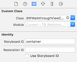
To create a new container you have just to add a new view controller into the Storyboard, from the Identity Inspector set its class to BWWalkthroughViewController and define a Storyboard ID (I’ve used ”container”).
Now just drag and drop the elements previously described (next, previous and close buttons and the page controller) and set their auto layout constraints as you normally do for your UI. Please note that if you don’t need any of these elements, you are not required to add them, you can even have a walkthrough completely UI-free!
Now that the elements are in place you have to set IBOutlet and IBAction connections:
1) Connect your next button element to the view controller property nextButton (ctrl + click on the button and drag toward the view controller icon).
2) Now perform the inverse connection, and connect the view controller to your next button (ctrl + click on the view controller icon and drag toward “next button”). You should see some actions. Select the nextPage() action.
You can do the same for your previous and close buttons, and do not forget to connect the page control (if available in your UI) to the pageControl property too.
You have created a working Container. Let’s create a couple of pages!
Pages setup
If you want to show N steps, you need to create N pages. Each page needs a View Controller. Add all the needed View Controllers to your Storyboard and assign them the BWWalkthroughPageViewController class and different Storyboard IDs (I’ve used page_1, page_2, page_3 and page_4).
Verify that the page has been correctly configured, you should see some custom elements under the attribute inspector.
Now you can place all the elements you need into your pages, you are completely free to set the design as you wish!
Initialize the Walkthrough
Now that all the elements have been created you have to initialize the walkthrough. The only needed step is to call the addViewController function to include the pages into the walkthrough. Here is a simple example of code to initialize the View Controllers from the Storyboard and attach all the pages to the container.
        let sub = UIStoryboard(name: "Main", bundle: nil)
        walkthrough = stb.instantiateViewControllerWithIdentifier("walkthrough") as! BWWalkthroughViewController
        let page_one = stb.instantiateViewControllerWithIdentifier("page_1")
        let page_two = stb.instantiateViewControllerWithIdentifier("page_2")
        let page_three = stb.instantiateViewControllerWithIdentifier("page_3")
        let page_four = stb.instantiateViewControllerWithIdentifier("page_4")

        // Attach the pages to the master
        walkthrough.delegate = self
        walkthrough.addViewController(page_one)
        walkthrough.addViewController(page_two)
        walkthrough.addViewController(page_three)
        walkthrough.addViewController(page_four)
You can find this code into the presentWalkthrough function of the MainViewController class. This controller is the initial view controller for this App and it is responsible to initialize and present the walkthrough. You can decide to present the walkthrough using different techniques. As example, you might use the application(_: didFinishLaunchingWithOptions:) function of the AppDelegate to choose which controller present, or create a custom structure using controller containment, this decision is strongly connected to your architecture design.
In this example we just present the walkthrough after the initial view controller is presented.
At this point the walkthrough is fully working 🙂
Prebuilt animations = no code needed!
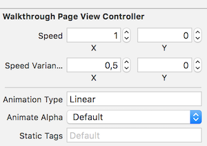
You can easily achieve some nice animations just modifying some settings that are reachable directly through interface builder, without writing a single line of code. Open the Storyboard and select one of your pages (not the container… a page!). In the attribute inspector you’ll see some interesting parameters.
• Speed:defines the speed of the animation for each axis.
• Speed variance: each element’s speed is incrementally increased by this value, if you keep it at zero all the elements will have the same speed, change it to easily obtain a parallax effect.
The factor that changes the speed variance is the element position in the hierarchy. The deepest element has the default speed, moving up through the hierarchy the speed variance will be added to the initial speed. An element at index 3 will have a speed equal to: speed + (3 * speed variance).
• Animation Type: The available values are “Linear”, “Curve”, “Zoom” and “InOut”. Essentially they change the algorithm that defines how to move elements during the transition to the next page and from the previous page. Playing with the animation type and speed you can achieve really nice effects! In the current example I’ve used Linear for the first page, Curve for the second and Zoom for the third. The last page uses a custom animation, we’ll talk about it later.
• Animate Alpha: set it to “On” to see a FadeIn/FadeOut effect during the page transitions.
• Static Tags: here you can list the elements that you don’t want to animate. These elements will follow the regular scrollview transition without performing any supplementary animation. Check page 3, the one with the Zoom effect. As you can see only the image is affected by the scale animation. The labels are not taken into account there, that’s because their tags are listed in the static tags field (2,3,4).
Have fun 🙂
Walkthrough delegate
In case you need to perform some custom actions during user navigation, you can leverage on 4 triggers handled by the walkthrough delegate functions, they are extremely self explanatory:
walkthroughCloseButtonPressed()
walkthroughNextButtonPressed()
walkthroughPrevButtonPressed()
walkthroughPageDidChange(pageNumber:Int)
A simple example that uses this function is the change of visibility for the close button. Let’s say that you want to display the button only when the walkthrough reaches its last page. You can easily implement the walkthroughDidPageChange in this way:
    fun walkthroughPageDidChange(pageNumber: Int) {
        if (self.walkthrough.numberOfPages - 1) == pageNumber{
            self.walkthrough.closeButton?.hidden = false
        }else{
            self.walkthrough.closeButton?.hidden = true
        }
    }
Another case of use of the delegate functions is the action that dismisses the walkthrough when the close button is pressed:
    fun walkthroughCloseButtonPressed() {
        self.dismissViewControllerAnimated(true, completion: nil)
    }
(check the MainViewController.swift example for more info).
Custom animations
As you can see, the last page of this example performs a completely custom 3D animation. Well, this animation is not included in the animation types previously described. That’s a really good news because it means that you can achieve whatever animation you want! If you don’t like what I’ve already built for you, I’m not going to complain 😛
To leverage on custom animations you have to create a subclass of BWWalkthroughPageViewController and override the method walkthroughDidScroll(position:, offset:).
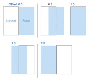
This method receives the scrollview x position and an arbitrary offset value. This offset changes depending on the position of the page in the walkthrough. If the page is partially or fully displayed the offset goes from 0.0 to 2.0, where 0 means the page is at the right of the currently displayed page, 1.0 when the page is currently fully displayed and 2.0 when the page is at the left of the current page.
You can easily create an algorithm to change whatever you want (colors, alpha, positions, scales..) for one or all the elements of the page in relation to this offset value. Check this example, here we apply a 3D rotation to the whole page layer.
    override fun walkthroughDidScroll(position: CGFloat, offset: CGFloat) {
        var tr = CATransform3DIdentity
        tr.m34 = -1/1000.0
        view.layer.transform = CATransform3DRotate(tr, CGFloat(M_PI)  * (1.0 - offset), 0.5,1, 0.2)
    }
This code has been included into the MyCustomPageViewController class, and the class has been assigned to the page 4 of the walkthrough.
Conclusion
This class has been created 1 year ago when swift was something quite new, so there is a lot of space for improvement on its code. I’m planning a complete restyle of the class for version 2.0, please feel free to suggest any improvement or feature that you would like to see implemented in BWWalktrough 2.0! You can alway reach me out on twitter @bitwaker or adding an issue to the GitHub repo!
Thanks to StockSnap.io for the amazing landscapes images and to FlatIcon.com for the cute pets icons.
Ciao!
Yari D'areglia
https://www.thinkandbuild.itCEO at Nexent.io by day, indie game developer by night. I also run the blog indiegames.wtf.
