I badly wanted to write a generic article about Apple Watch development because I really needed to resume what I’ve learned so far. That being said, in this article you’ll read an overview that might be really useful if you are starting with Apple Watch development. The article introduces the main WatchKit concepts and provides links to external resources to topics that you might need to examine in depth, giving a full path that you can follow to learn how to write Apple Watch applications.
Project setup
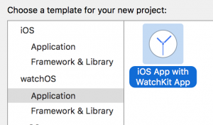
You can start a new Watch project in two ways: Creating a completely new Watch application or adding a new target to an already existing application. In booth cases you have to choose the option “WatchKit App” under the WatchOS tab from the project wizard.
You’ll see two new root folders under your project hierarchy, one for the WatchKit app and the other for the WatchKit Extension (we’ll talk about these elements later).
Simulators!
Weather you own a watch or not, I strongly suggest to setup a simulator. Bad news: as you’ll learn while developing your first Watch application, testing on a real device is a pain in the neck. Sometimes the application doesn’t start and in general it takes ages to launch (I’m referring to Xcode 7.2, I hope the situation gets better in the next Xcode releases).
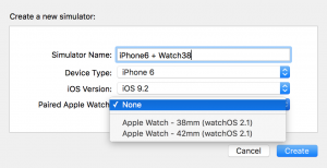
That being said, to create a simulator just open the “Window->Device” panel and click the “+” button at the bottom right of the window, then, select “Add Simulator”.
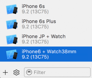
From the modal that appears you can set the name for your new simulator and select the phone and the watch models that you prefer, the new device should appear in the list of available simulators.
WatchKit and WatchOS Application architecture
Before writing any code let’s have a quick overview of what a WatchOS application is and what you can build around it.
WatchKit Extension and Watch App UI
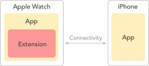
A Watch App structure is based on 2 main elements: the WatchKit Extension and the Watch App UI. The Extension is where all the logics take place and where the UI is updated, the App UI is obviously responsible to design all the App views and define navigation trough segues. These two elements are well separated in the project using the two folders we have previously introduced. If you look at the Extension folder you’ll see some files and dedicated assets, while the Watch App folder contains only a storyboard and the assets catalog.
The WatchKit Extension is the core of your application, only from WatchOS 2.0 it has been moved from the Phone App system to the Watch App system giving more power to the companion Watch App. Thanks to this update you can perform complex tasks directly on the Watch (like network calls) and, in general, all the App gains in responsiveness.
The communication between iPhone and Watch takes place through the Connectivity framework. We’ll talk about it in details later, for now it suffices to say that thanks to this framework you can exchange data and messages between an iPhone and its paired Watches. The WatchKit Extension is where all the connectivity logics are placed for the Watch side.
Watch App parts
When you work on a Watch App you have to know that you can create different elements that users can run on their watch.
The main actor is obviously the App itself, a user can run it from the Watch home screen where all the other apps are listed.
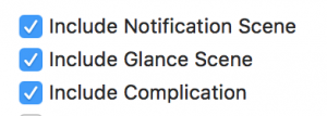
You should have noticed that creating a new project you can flag some options to include other elements inside the App: Glance scene, Complication and Notifications scene.
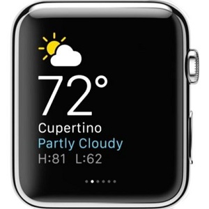
Briefly, a Glance is a non interactive single view where you can present important information from you app. The main role of Glances is to present simple and immediate data, this is not the right place to perform complex tasks or long network calls then. This view is perfect to present time based information or other previously cached data. A user is presented with the installed glances swiping up on the Watch screen. This article by NatashaTheRobot explains in details how to crete a glances.
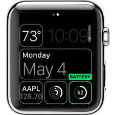
A Complication is a little element available in the watch quadrant that shows simple information like date, battery level or the next alarm. You can provide different formats of your complication (circular, modular and utilitarian are the shapes you can choose from) and users can decide where to put your complication depending on the available Watch face slots.
Complications are strongly time based and they get organized leveraging on a data source that responds to requests like: “which information should I show at 2pm?”. When user activates time travel, moving the digital crown, complications get updated with the right data for the time selected, so you should provide data for present, past and future date (fear not, time travel is limited to a 72 hours range). This is the best tutorial about complications development so far, it stars from a generic ClockKit explanation down through a detailed guide to code for complication.
The Interface Controller
Really similarly to iOS, a Watch Kit scene is defined by a view designed through a storyboard and an Interface Controller (the counterpart of an iOS View Controller), responsible to update contents at screen and to handle requests coming from the UI. This object is an instance of the WKInterfaceController class. When you start writing your first Interface Controller you probably look for the viewDidLoad method, well you are not going to find it 🙂 the right method to setup your Interface Controller is awakeWithContext:. The context is an handy way to pass information through Interface Controllers, it is just a dictionary that you can pass during navigation that will be available to the presented controller through the awakeWithContext: method. You’ll find this logic extremely useful, personally I’d love to have something similar in iOS.
Other interesting method exposed by the WKInterfaceController class are willActivate() and willDeactivate(), as you can imagine they are called when the controller is about to be presented and when it gets dismissed.
Navigation through controllers is extremely simple. Essentially you can present a new controller modally or using a page-based navigation. You are not going to use anything similar to navigation controller or tab controller, you just push or present the next controller using methods like pushControllerWithName:context: and
presentControllerWithName(_:context:). You can note that those methods receive just the controller name instead of requiring an instantiated controller, the name corresponds to the storyboard identifier.
This time I suggest you to go through Apple Documentation. They have a really detailed overview of the Interface Controller object and in general about the Watch App structure.
User Interface
The starting point for a Watch App user interface is the Storyboard. Here you can design views for the Interface Controllers, Glances and Dynamic Notifications. A WatchKit Storyboard works exactly as the iOS version; you can drag and drop elements on the main dashboard and create segues between controllers. The big differences you’ll encounter are related to the layout system. Instead of AutoLayout, WatchKit relies on a really simple system that automatically defines the UI element frames for you, simplifying a lot the way you design views.
Basically you can place elements on the UI and define size and position with simple rules. Size can be specified with fixed values, defining values relative to the container size or accommodating the element contents. To define the position of the element you have some more restrictions; you can define the element preferred alignment for the 2 axis using Left, Right, Top, Bottom and Center, the layout system will automatically choose a position for the element relatively to the other UI elements.This article provides a well detailed explanation of how to handle WatchKit layout system creating the UI for a simple application.
You can select UI elements between a pool of object provided by WatchKit. You already know how some of these elements work. You can create labels, buttons, switches, tables and pickers but not all these elements work exactly as they work with iOS. Take the Table as example; you are used to setup a Datasource and a Delegate, while with the WatchKit the entire flow is way more simple, you can setup directly the number of rows with the table.setNumberOfRows function and you manage different cell types using row controllers.
A comprehensive list of this parts is available on the
Apple Human Interface Guide while a detailed explanation of each component with example code can be found on the Documentation (check the left menu).
Communication between devices
Sending information back and forth between watch and phone is an operation handled by the Connectivity Framework. Essentially you can send information with direct messages, in background using a context or even share files and data.
The communication is managed by a Session and depending on the type of message system that you choose you have to perform some checks on the Session state (as example, you have to verify that the device is reachable before sending it direct messages). You can read more about this topic on
this article. Keep in mind that the connectivity framework has been introduced with WatchOS2, you might find some other articles that talk about communication with the “Parent Application”, don’t waste your time with those articles since they are out of date. If you have some more time to spend check the WWDC session 713 Introducing Watch Connectivity, the talk also goes through how to adopt NSURLSession directly from a watch app.
Conclusions
I hope you have enjoyed this guided trip through Watch development. Please let me know if there is anything I’ve missed or that it’s worth mentioning, I’d be really glad to include all your suggestions in this article!
Yari D'areglia
https://www.thinkandbuild.itCEO at Nexent.io by day, indie game developer by night. I also run the blog indiegames.wtf.
