Yesterday I released Prio, my very first self-produced iOS application! It’s essentially a to-do, done-list and reminder app (yeah, something new, uh!?) with an extremely customized user interface.
So, since I had the chance to experiment a lot with custom UI, graphics and structure, I thought it’d be interesting to write an in-depth article about how those elements have been implemented in Prio. Without further ado let’s disassemble it, starting from the Navigation.
Even though the side menu has fallen from grace, I decided to base the main navigation on this control. Personally, I prefer not to have too many navigation elements in my views: using a single button to show all the entry points to the other pages is still something I prefer over other common solutions.
Custom Container
That said, to implement the side menu I’ve created a totally custom container.
This container manages 2 main view controllers. One is the menuViewController that is responsible for handling the menu view and triggering the “change content” action when the user taps one of the menu items. The other is the contentViewController, where the content of the application is drawn. Every time a user taps one of the menu items, the corresponding view controller takes the place of the contentViewController.
Here is part of the code used to switch the current view controller with the next controller.
- (void)changeContentViewController:(UIViewController *)nextContent
                           animated:(BOOL)animated
{

    if(![self.contentViewController.restorationIdentifier
       isEqualToString:nextContent.restorationIdentifier] ){
        self.contentViewController = nextContent;

        if(animated){
            self.isChangingContent = YES;
            [self animationChangeContent];
        }
    }else{
        [self hideMenuViewController];
    }
. . .
Custom Transitions
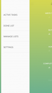
As you can see, a 10 point border is drawn to the left side of the screen while the rest of the view slides nicely to the right, showing the underlying menu.
This effect has been created using a really simple custom transition, taking two screenshots of the current view and animating only the rightmost screenshot. Here is the part of the code responsible of taking the snapshots and configuring the views for the animation.
self.snapshotContentView = [self.view resizableSnapshotViewFromRect:CGRectMake(self.sideLineSize, 0, CGRectGetWidth(self.view.bounds) - self.sideLineSize, CGRectGetHeight(self.view.bounds))
                                                     afterScreenUpdates:NO
                                                          withCapInsets:UIEdgeInsetsMake(0,0,0,0)];
    self.snapshotSideLine = [self.view resizableSnapshotViewFromRect:CGRectMake(0, 0, self.sideLineSize, CGRectGetHeight(self.view.bounds))
                                                  afterScreenUpdates:NO
                                                       withCapInsets:UIEdgeInsetsMake(0, 0, 0, 0)];

    self.snapshotSideLine.frame = CGRectMake(0, 0, self.sideLineSize, CGRectGetHeight(self.view.bounds));
    self.snapshotContentView.frame = CGRectMake(self.sideLineSize, 0, CGRectGetWidth(self.view.bounds) - self.sideLineSize, CGRectGetHeight(self.view.bounds) );

    [self.view addSubview:self.snapshotSideLine];
    [self.view addSubview:self.snapshotContentView];
	  .
    .
    self.contentViewController.view.hidden = YES;
This code has two references to snapshotSideLine and snapshotContentView (so that I can easily access the elements when the menu is presented and perform the “close menu” animation), it places the snapshot as subview of the main view and hides the real contentViewController.
The animation that moves the snapshotContentView to the right is implemented this way:
    /* Define the animation */

    [UIView animateWithDuration:self.animationDuration
                          delay:0.0
                        options:(self.isInteractive) ? UIViewAnimationOptionCurveLinear : self.animationCurve
                     animations:^{

        self.snapshotContentView.center = [self positionForSnapshotInStatus:BWSideStatusMenu];
        self.menuViewController.view.layer.transform = CATransform3DMakeTranslation(0.0, .0, 0.0);
        self.menuViewController.view.alpha = 1.0;

    } completion:^(BOOL finished) {

        if (self.transitionCancelled) {
            self.snapshotContentView.center = [self positionForSnapshotInStatus:BWSideStatusContent];
            self.status = BWSideStatusContent;
            [self resetSnapshot];   // reset content view and snapshot

        }else{
            self.status = BWSideStatusMenu;
        }

        [self transitionDone];  // reset static state
        //[self setNeedsStatusBarAppearanceUpdate];   // Reset the status bar to Visible
    }];
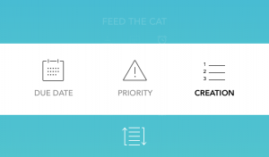
The same trick has been adopted to achieve the animation that shows the task order selection at the bottom of the task list view.
Custom Collection layout
I’m really proud of the result achieved with the layout for the task collection view. I decided not to use a table view because I wanted to be free to design custom effects and, later, improve the task presentation with an even more custom layout. The peculiarity of this view is the smooth fade in-out effect for every task entering and exiting the view.
This effect can be achieved thanks to a custom UICollectionViewLayout subclass.
The layout is invalidated every time the user performs a scroll. This means that the function prepareLayout was a good point to enter all the logics to create the fade effect.
Here’s the main block of code used to generate the alpha, if you’re curious:
/* Items Cycle */

for (NSInteger i = 0; i < items; i++ ) {

    // Define item size / position
    NSIndexPath *indexPath = [NSIndexPath indexPathForItem:i inSection:s];
    UICollectionViewLayoutAttributes *attr = [UICollectionViewLayoutAttributes
                                                layoutAttributesForCellWithIndexPath:indexPath];
    attr.size = self.itemSize;
    attr.frame = CGRectMake(0, i * (self.itemSize.height + self.itemEdge.bottom) +
                                    self.itemEdge.top,
                                    attr.size.width,
                                    attr.size.height);

    // Generate Fade in/out effect
    float cellYScreen = attr.frame.origin.y - self.collectionView.bounds.origin.y;
    float marginBottom = (self.stickToBottom) ? 0 : 50;
    float bottomExit = self.collectionView.bounds.size.height -
                       (self.itemSize.height + marginBottom);

    // Top of the Screen
    if (cellYScreen < topExit){
        // ShameOnMe Hardcoded stuff
        float shift = 10.0;
        // Get the alpha
        attr.alpha = (cellYScreen - shift) / (topExit - shift);
    }

    // Bottom Of the screen
    else if(cellYScreen) > bottomExit){

        float d = cellYScreen - bottomExit;
        attr.alpha = 1 - (d / 30.0); // shut down the alpha in 30px starting from bottomExit
    }

    // Middle of the screen
    else{
        attr.alpha = 1.0;
    }

    [tempAttributes setObject:attr forKey:indexPath];
}
Data and iCloud
All the Application data is managed with Core Data. I haven’t implemented anything special and the main database structure is extremely simple.
Each entity has been wrapped into a category so that I could add specific functionalities and helpers to my models maintaining the flexibility of the auto-generated Managed Object classes.
Here is an example of the code for the MOTask+Management category, the Managed Object that represents the tasks.
Inside the category code I’ve created all the helpers that I need to handle instances for this class. In the following code you see part of the CRUD implementation.
/* INSERT */

+ (MOTask *)insertTaskInContext:(NSManagedObjectContext *)context
{
    MOTask *task = [NSEntityDescription insertNewObjectForEntityForName:ENTITY_TASK inManagedObjectContext:context];
    task.status = @(TaskStatusActive);
    return task;
}

+ (MOTask *)insertTaskWithName:(NSString *)name InContext:(NSManagedObjectContext *)context
{
    MOTask *task = [NSEntityDescription insertNewObjectForEntityForName:ENTITY_TASK inManagedObjectContext:context];
    task.name = name;
    task.uniqueIdentifier = [[NSProcessInfo processInfo] globallyUniqueString];
    task.creationDate = [NSDate date];
    task.status = @(TaskStatusActive);

    return task;
}
A new entry in my developer tool belt is Ensembles.io. This is a really useful Core Data sync framework that helps you store databases on iCloud without facing the boring issues and limitations that normally afflict Core Data with the native iCloud support.
Ensembles breaks down a persistent store into a series of transaction logs representing all the insertions, deletions and updates that take place inside the database. These transactions are stored in small files (logs) that are sent to iCloud (or to your persistence service of choice since Ensembles supports Dropbox, iCloud and even custom servers). Only new chunks of data are remotely synced ensuring really good performance and reliability.
Including Ensembles inside the project was extremely easy and I had to change only a tiny portion of my code: all it took was passing the managed object context and the store URL during the Core Data stack setup
    // Setup Sync Manager
    IDMSyncManager *syncManager = [IDMSyncManager sharedSyncManager];
    syncManager.managedObjectContext = self.managedObjectContext;
    syncManager.storePath = self.storeURL.path;
    [syncManager setup];
and calling a sync function every time I want to request a remote sync.
[[IDMSyncManager sharedSyncManager] synchronizeWithCompletion:^(NSError *error) { …
Another interesting feature is Ensemble’s ability to automatically avoid the duplication of data. You only have to set a uniqueIdentifier property on the Entities for which you want to ensure uniqueness. At that point, you are responsible for the generation of unique IDs across the whole system and Ensemble uses this information to understand if an instance of an entity already exists in the database, for example after a merge operation. I suggest you to keep an eye on Ensembles, it is a really good product!
User Interface, Icon, Themes!
I really don’t know where to begin. Despite previous unreported attempts, before Prio, I’m not a designer and this is my really first (almost) complete application design. Why “almost”? because I got a huge help from Lorena! She’s my hopefully-soon-to-be-wife… if only I worked up the “courage” to ask her in a creative way. I’m telling you because she’s not going to read the article so please… don’t spoil the surprise! 😉 Wait a second, what if she read, instead? This could be my (very nerd) best chance to… no, no way, enough with the babbling. Focus. The article.
So… The design of the application was initially created with Photoshop. I don’t have any screen from the really first prototype (lucky you, it was terrible). Then I decided to learn how to use Sketch and I’m pretty sure I’m not going to need Photoshop again in my iOS app developer life. Sketch is just fantastic… I’ve since created my own plugin to easily generate all the x1, x2, x3 assets in one click and it speeds up the assets creation process incredibly. If you are interested in this topic, you can find my tutorial to build this plugin here .
Regarding icon and logo… I love them both. They are simple and minimal and again they were conceived and built with Sketch. You can just create a new art board selecting “iOS Icon”, what more do you want?
What about the themes? creating 20 nice gradients is not as easy as I thought! I spent a lot of time with Lorena trying to find a good sequence of colors, trying not to be too ordinary. 90% goal achieved, I’d say! I really want to add some more themes in the future and maybe refine the ones included.
This said, I know you’re here for the code. Let’s see what the theme management is about.
We wanted to have a way to preview all the gradients and immediately try them out in the app. The solution I found was drawing the gradients with Sketch and exporting them as single images. Then, with a badly-coded ruby script, I generated the Objective-C code that handles all the themes. Most of the logic is hardcoded, but the interesting part is that the ruby script reads the folder that contains the exported images and for each one gets the colors and builds the gradient. It then pastes the code into an Objective-C template file.
With this in-house solution we were able to add or remove themes just using Sketch, the rest of the process was handled by Ruby.
Here is part of the Ruby script (sorry, I suck at Ruby)
[code lang=”Ruby”]
def buildTheme(name,r,g,b,r1,g1,b1)
name.gsub! ‘.png’, ‘’
$themes << “
– (void)#{name} {
self.gradientLayer.colors = @[(id)[UIColor colorWithRed:#{r/255.0} green:#{g/255.0} blue:#{b/255.0} alpha:1.0].CGColor,
(id)[UIColor colorWithRed:#{r1/255.0} green:#{g1/255.0} blue:#{b1/255.0} alpha:1.0].CGColor];
[self defaultGradientSetting];
}
“
$list << “\n\t\t\t@{@\”name\”: @\”#{name}\”,\t@\”func\”: @\”#{name}\”,\t@\”themeColor\”:[UIColor colorWithRed:#{r1/255.0} green:#{g1/255.0} blue:#{b1/255.0} alpha:1.0]},”
end
$themeFiles.each do |filename|
puts “Building #{filename}”
image = ChunkyPNG::Image.from_file(“screens/#{filename}.png”)
r = ChunkyPNG::Color.r(image[0,0])
g = ChunkyPNG::Color.g(image[0,0])
b = ChunkyPNG::Color.b(image[0,0])
r1 = ChunkyPNG::Color.r(image[0,567])
g1 = ChunkyPNG::Color.g(image[0,567])
b1 = ChunkyPNG::Color.b(image[0,567])
buildTheme(filename,r,g,b,r1,g1,b1)
end
And that’s a wrap for this post. I wanted to cover those that for me are some of the most interesting parts of Prio. If you have any question about the application or if you want to know how any particular aspect has been implemented I’d love to answer you so, by all means, just ping me on twitter!
Yari D'areglia
https://www.thinkandbuild.itCEO at Nexent.io by day, indie game developer by night. I also run the blog indiegames.wtf.


