Ladies and gentlemen, let’s start this tutorial with the right mindset:
Auto Layout is SIMPLE!
It took me a while to grasp how Auto Layout works and now, looking back, I get that I’ve absolutely overestimated the problem. In this article I’m going to introduce some basic aspects and some tricks that I’m sure will help you face Auto Layout with no fear.
Xcode >= 5
Before Xcode 5, Auto Layout was probably the most annoying “feature” you had to implement in your app. Flagging “Use Auto Layout” was like saying “Kick me in the nuts”. That’s why I never ticked that flag. Shame on me!
With Xcode 5 it’s a completely different story though, and if you still have nightmares about Xcode 4, well, forget them!
Auto Layout in a few words
With Auto Layout you arrange your app’s UI using relations between UI elements. These relations are called constraints.
At first, this sounds really hard to grasp, because we are used to place subviews independently, considering just where and how to draw them modifying frame/bound properties.
This is the first goal of this article: Leaving outdated habits behind!
Introduction to Xcode 5 Auto Layout UI
We can setup Auto Layout relations programmatically or directly through Interface Builder. I’ll show you some aspects of “Auto Layout-Coding” in the next examples, but for now we’ll just keep it simple with Xcode UI.
Create a project and open the main storyboard. At the lower right corner you can see a bunch of icons that group different options for Auto Layout. We’ll speak about some of these buttons in the examples, now just remember that al these icons are Auto Layout related.
Another way to interact with Auto Layout is directly through the views. Put a UIView in the View Controller, ctrl+click and drag the mouse around. You should see a blue selector. You already know it because it is the same we use to connect IBOutlet(s)/IBAction(s), but this time if you release it over the new view itself you’ll see some new choices.
Let’s add a constraint to the view we just created.
1. Ctrl+Click over the view
2. Drag the mouse keeping an horizontal trajectory. This ensures that the “width” parameter shows up when you release the mouse button over the same view. You can try to move vertically to obtain the height parameter (personally I find this behaviour a great User Experience choice).
3. Choose the “width” parameter
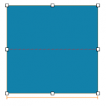
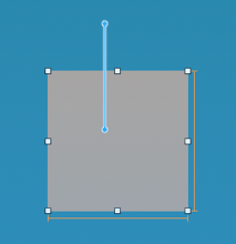
You’ve now created a constraint that says “This view has a width of N points”. Don’t pay attention to the red/orange lines that are drawn over the view. We just need this constraint to take a look at some other Xcode features.
Selecting the UIView and opening the Size Inspector panel.
![]()
You’ll find a new area called Constraints that in our case contains the width constraint we just added.
Note: sometimes instead of “Width/Height” parameters you might find “Leading space to”. It’s just a bug, deselect and select again the view to get the right parameters.
From here, you can modify the constraints or delete them using the cog icon.
Another place where you can find information about your constraints is the Document Outline, the left column of the storyboard, you can open it by clicking this icon ![]()
As you can see we have full access to the constraint that we have just created. Click over it, and the constraint will be highlighted in the views editor.
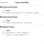
Another useful information we obtain from the Document Outline is the presence of Auto Layout inconsistencies or errors. The red circle with the white arrow at the top-right corner tells us that something hasn’t been set correctly.
Click over the arrow and a new view will show the errors with some more details.
Just click over the first red dot. Xcode is smart enough to suggest you the right auto layout configuration. Click “Add missing constraints” and automagically some constraints will be added to the view and all the errors will disappear.
If you click the view again, you’ll see the new constraints, but this time they’ll be blue. This means that all the needed constraints have been defined and Auto Layout knows exactly how to draw your view.
Example 0: Introduction to constraints
Now that you know how to interact with Xcode to manage constraints we can practice with Auto Layout and learn how it works.
The main rule we should keep in mind is that to specify the position of a view through Auto Layout we need to give it constraints for X/Y position and Width/Height size. This is the first step to make it work correctly.
Open the project for this tutorial and check the Example_0 Result controller in the Main Storyboard. You can easily move through examples using the Document Outline window.
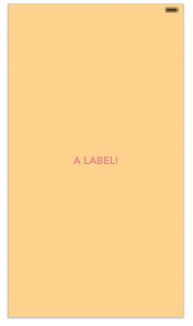
This is the final result of this first example: a UIView centred vertically and horizontally, regardless of screen size and orientation.
You can now create your own project or simply use mine (you can find the source at the end of the article). Here I have created the initial setup for all the examples of this tutorial (named EXAMPLE_N START) and the final result (named EXAMPLE_N RESULT).
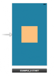
Move to the EXAMPLE_0 START
1. Here you can find a yellowish UIView as subview of the main view. I set the View size to 150X150 and I place it at X 85 and Y 209 (just following the blue guides).
I like this kind of approach. Before adding any constraints we define view’s size and position. We don’t care about constraints since we have not done with this initial setup.
2. Now let’s add the size constraints using 2 different methods.
As we did in the previous section just ctrl+click over the new view and drag the mouse horizontally to add the width constraint.
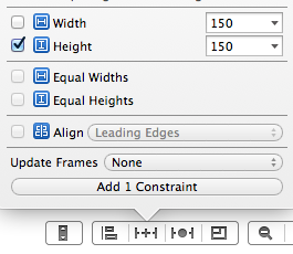
Now, to add the height constraints we can use the icons at the bottom right corner. Select the yellow UIView, click on the icon with the “+” flag the “Height” param and click the “Add Constraints” button. This is just another way to setup a constraint.
We have defined the size constraints!
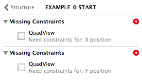
3. Click the red circle on the Document outline to get information about the problems of our view.
As I told you we need to setup Width/Height and X/Y to be compliant with Auto Layout required conditions and Xcode is helping us highlighting what is currently missing.
We could ask Xcode to automatically adjust the errors as we did before using the “Add missing constraints” button or manually add the needed constraints. Let’s do it manually this time, to see how to create a relation between a view and its super view.
Again we can choose two different ways to add constraints:
Ctrl+Click the UIView but this time drag over its super view maintaining a vertical trajectory.
Select “Center horizontally in the container”. You can verify the new constraints in the Size Inspector named “align Center X to: Superview”.
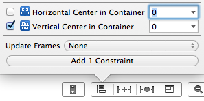
To add the vertical (Y) information we use the first icon that shows the alignment constraints option. Click the button and check the “Vertical center in container” flag. Click the “Add Constraints” button to confirm.
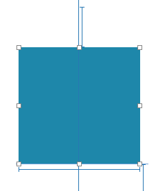
You should see 2 new blue line crossing the view and all the needed constraints are now created.
4. Launch the App and switch between portrait and landscape.
Eureka! The Yellowish view stays in its centred position.
(You can verify the difference removing the constraints. In landscape mode the view will just move outside of the screen.)
Xcode helpers
Another interesting feature is the ability of Xcode to reset frames and constraints on the fly to automatically maintain your auto layout setup.
With all the previous constraints set, move the Yellow view to a new position (just enter for example 120 for the X and 240 for the Y. Change the coordinate through the Size Inspector, don’t modify the constraints).
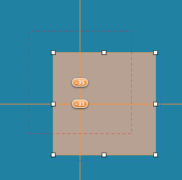
You should see something similar to this:
Your position constraints turn to orange indicating a view misplacement, a red dashed square highlights the “expected” frame and 2 labels reveal the gap between this frame and the current frame.
You have a lot of information shown in the Document Outline. This time the indicator is not red but it is orange to indicate the view misplacement more as a warning, than an error. Indeed the Auto Layout conditions are still valid even though what you are seeing in the storyboard is not the runtime result.
So, how can we solve this? First you have to decide what your desired result is.
Do you want to keep the initial setup?
In that case click over the “dot” icon
![]()
and select “update frame”. And the view will just move to reflect the runtime frame (the red dotted one) defined by constraints.
Do you want to update the runtime frame?
In that case click over the icon and select “update constraints” to change the constraints to match the current frame.
Try it and see the difference between the two.
Example 1: Intrinsic content size
Ok now switch to the EXAMPLE_1 RESULT view controller.
In this example we want to obtain the exact result of EXAMPLE_0 but with a UILabel.
Move to EXAMPLE_1 START and add the position constraints only (Check step 3 of the previous example if you find yourself lost).
Aaaaand you are done! You can check the result launching the App. The label is exactly at the centre of the window.
Wait, you might ask, what about the size constraints? Don’t we need to set them too like we did in the previous example? No, we don’t! Even more, setting them could be considered an error.
Some leaf objects like buttons and labels define their size depending on their contents. A special method named intrinsicContentSize is responsible of returning the size information for this kind of view so you shouldn’t overload this information through constraints.
In this tutorial we don’t speak about auto layout for custom views but if you want to create a view with auto-size behaviour your should learn more about this method.
Example 2: Screen size independent UI
When it comes to create UI for 3.5″ and 4″ screens or to create portrait and landscape UI Auto Layout can make the difference.
Switch to EXAMPLE_2 RESULT. I want to show you how to face a really common situation: defining a layout that works at any screen size and orientation.
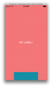
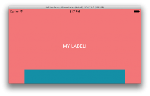
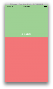
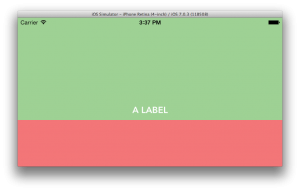
Launch the application on iPhone4 and iPhone5 and change the orientation. As you’ll see the layout just adapts to the screen size. Here are some screens:
You already know how to centre the UILabel, but what about the blue view at the bottom of the screen? Let’s switch to EXAMPLE_2 START. You can setup the label as exercise,
while the blue UIView has 2 particular aspects that we have to take into account:
• its width changes depending on the screen size
• it is attached to the bottom of the screen
Let’s keep in mind the first rule, we have to satisfy booth position and size constraints.
1. First things first, set the desired position by moving the Blue view at the bottom of the screen.
2. We can easily setup the height constraint just by (ctrl+click) dragging vertically the view and choosing “height” or with the bottom icons as I’ve previously shown you.
3. What about the width? We want to keep it relative to its superview and to do that we create 2 relations:
• “Maintain a fixed distance of N points from the left side (leading) of the view and the left border of its superview”
• “Maintain a fixed distance of N points from the right side (trailing) of the view and the right border of its superview”
These two relations automatically let the width of the view change when the superview size changes.
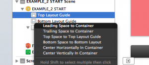
To create these relation we can ctrl+drag from the blue view to the left side of the superview and select leading space to container and to the right side and select trailing space to container.
At this point we have satisfied all the size constraints. Let’s set up the position.
4. Again we need to refer to the superview to define a constraint for the blue view. It is very easy, the relation is just:
• “Maintain a distance of ZERO from the bottom of the superview”
This information is enough to define a vertical position for the view because the superview position is always defined.
So we can add this constraint just as before… ctrl+drag from the view to the bottom of the superview and select bottom space to bottom layout (you can release the mouse over the blue view).
Note: You can ctrl+drag directly in the Document Outline. In this case you’ll see every possible constraint.
At this point all the needed relations are satisfied and your simple UI adapts to the screen size.
Example 3: Updating constraints programmatically
Sometimes to obtain some complex view positioning we need a bit more control over constraints. As constraints are just instances of the class NSLayoutConstraint we can obviously access some properties at runtime, programmatically.
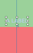
Moving to EXAMPLE_3 RESULT, you’ll see a White UILabel that is aligned to a Red View. If you run this example and you switch from portrait to landscape and back, the Red View changes height to fit the screen size.
Let’s see how to obtain this behaviour!
1. Move to EXAMPLE_3 START
2. Add these constraints to the Red View (BottomView):
• Leading and Trailing space to superview to define the width depending on the superview (as we did in the previous example)
• Bottom space to superview, to stick the RedView to the bottom of the superview (again, check the previous example)
• Height (Do you remember? ctrl+click and vertical trajectory)
If you did all these steps correctly you should end up with blue constraints for the BottomView.
3. Add these constraints to the UILabel
• Center the Label Horizontally (Ctrl + Click label and drag Horizontally and select the right constraint)
• Define a vertical space between UILabel and BottomView. (Ctrl+Click Label, drag over the BottomView and release. Then select Vertical Spacing).
Now you should have defined the needed constraints for the UILabel too.
At this point if you run the example you’ll see that the BottomView doesn’t resize vertically. Indeed we haven’t set any behaviour to make it work like that. So let’s define it now.
4. I have already associated the Class ResizerViewController to this view controller. Open the file ResizeViewController.m and you’ll see the first property:
@property (weak, nonatomic) IBOutlet NSLayoutConstraint *CS_BottomView_Height;
5. Let’s connect this Outlet to the height constraint we had previously added.
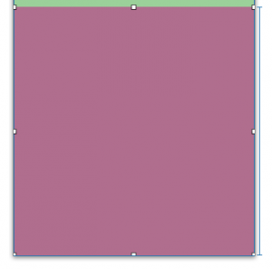
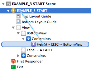
So open the Storyboard again and from the Document Outline ctrl + click over the EXAMPLE_3 START row and drag over Height constraint (check the next screenshot). Release and connect the CS_BottomView_Height.
Now we can just update the value of the constraint as we do for any other object.
6. Open ResizerViewController.m file and check this function:
- (void)willAnimateRotationToInterfaceOrientation:(UIInterfaceOrientation)toInterfaceOrientation duration:(NSTimeInterval)duration{

    if (UIInterfaceOrientationIsLandscape(toInterfaceOrientation)) {
        self.CS_BottomView_Height.constant = 100;
    }else{
        self.CS_BottomView_Height.constant = 330;
    }

    [self.bottomView setNeedsUpdateConstraints];
}
Here we just update the constant property of the height constraint to set a totally arbitrary value depending on device orientation.
If you run the example you can see the result.
Conclusions
From my direct experience, what I’ve shown you in this tutorial is all you need to get started with Auto Layout. This said though, there are many other Auto Layout functionalities worth studying like “Priority”, Auto Layout Visual Format Language and some more advanced uses of NSLayoutConstraints. I might write about them too in a future post.
As always, stay tuned and thanks for reading!
Yari D'areglia
https://www.thinkandbuild.itCEO at Nexent.io by day, indie game developer by night. I also run the blog indiegames.wtf.


